OMA
Client
OMA
Project
Rebranding pitch for Colombian coffee chain (2018).
Credit
Teamwork developed by Superunion.
Reimagining a heritage coffee brand for modern consumers
CONTEXT - As one of Colombia's most established coffee chains, OMA faced increasing competition from a new generation of café brands that offered stronger emotional appeal and more distinctive customer experiences. The brand needed to evolve beyond its heritage to remain relevant in a changing market.
CHALLENGE - Reposition the brand by creating a more engaging and contemporary customer experience while preserving the recognition and authenticity that had made OMA a trusted name for generations of coffee lovers.
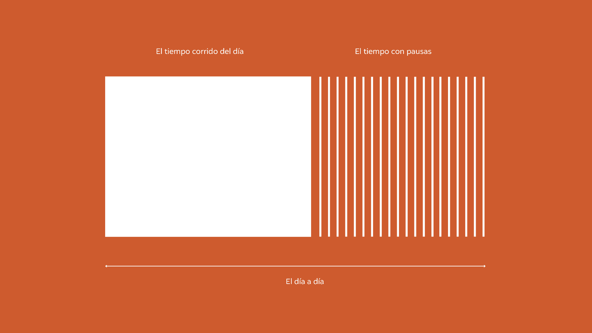
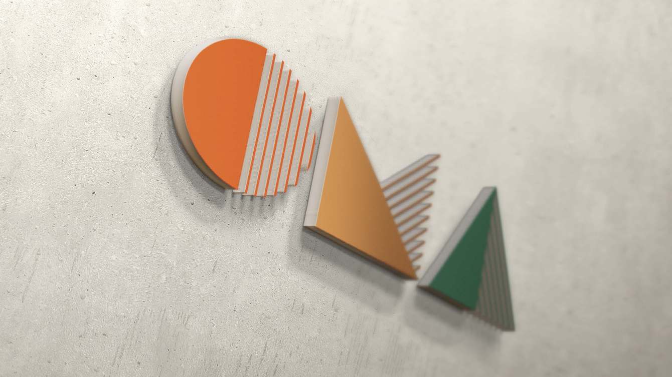
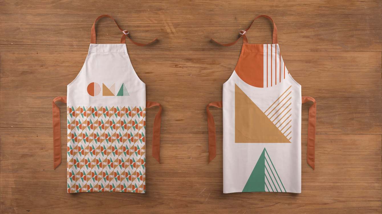
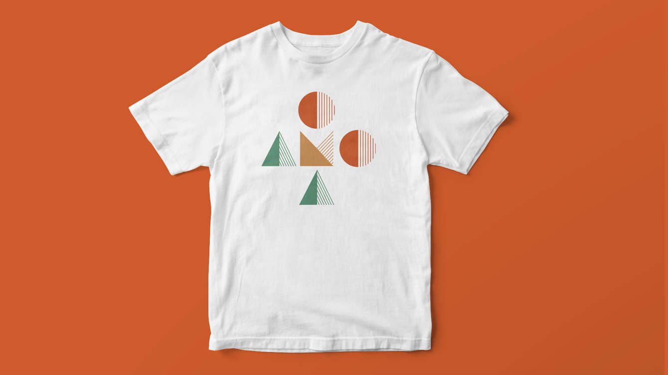
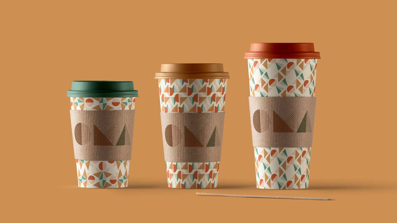
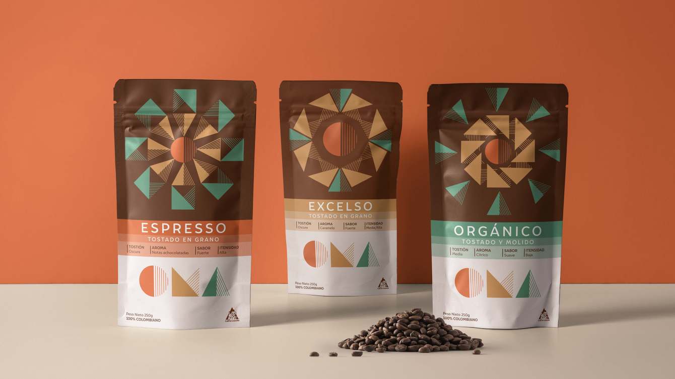
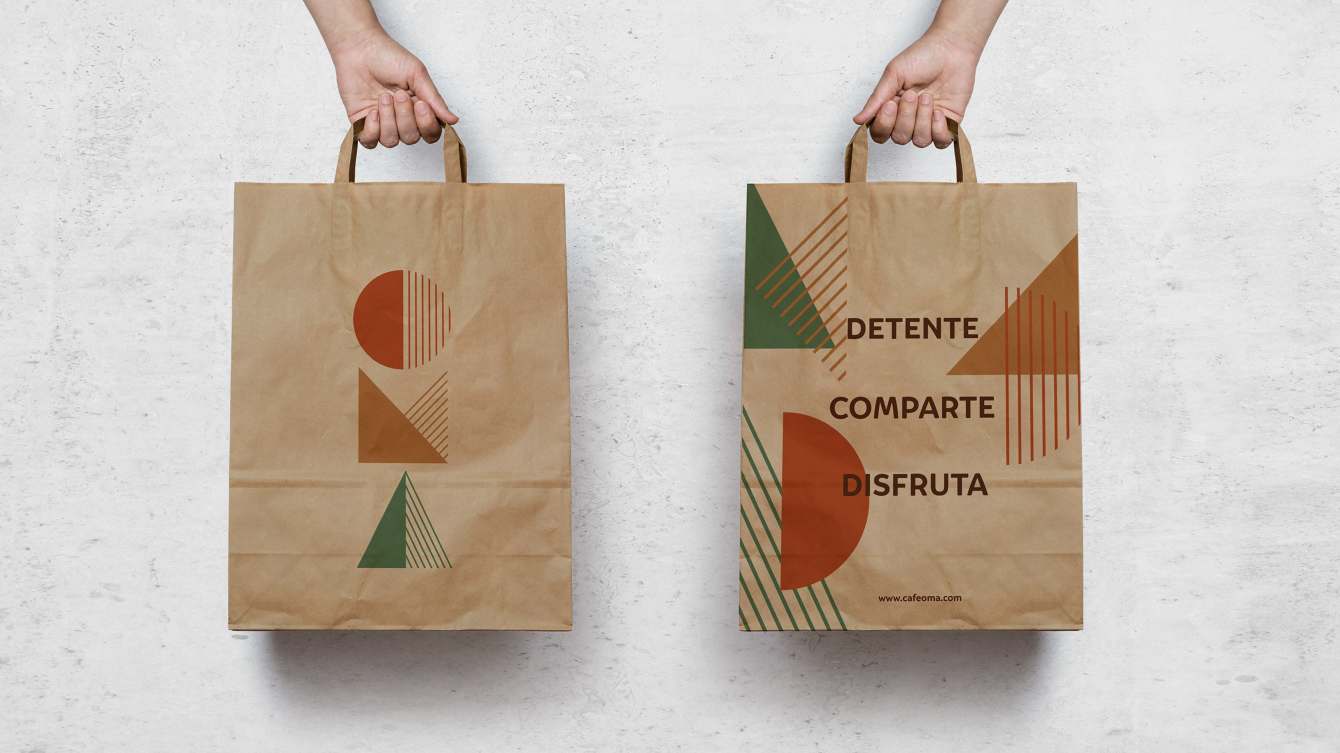
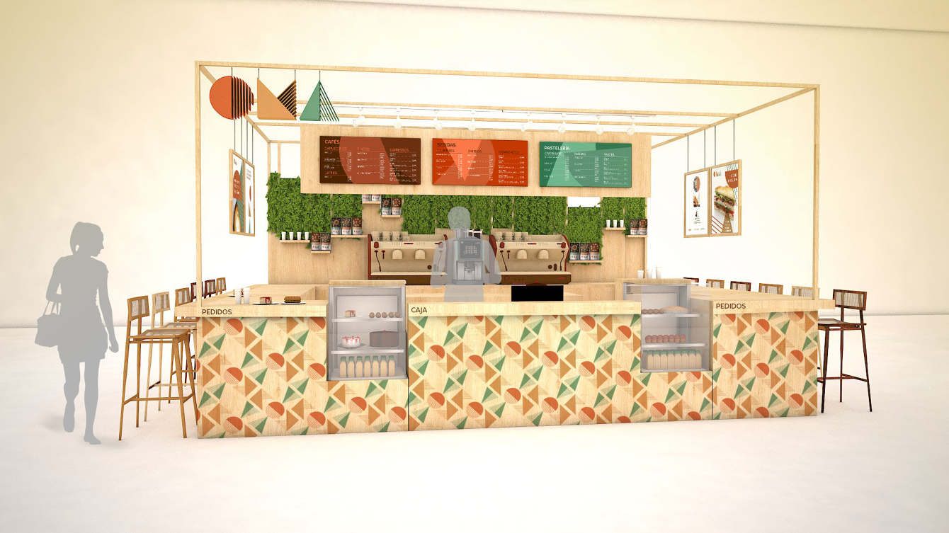
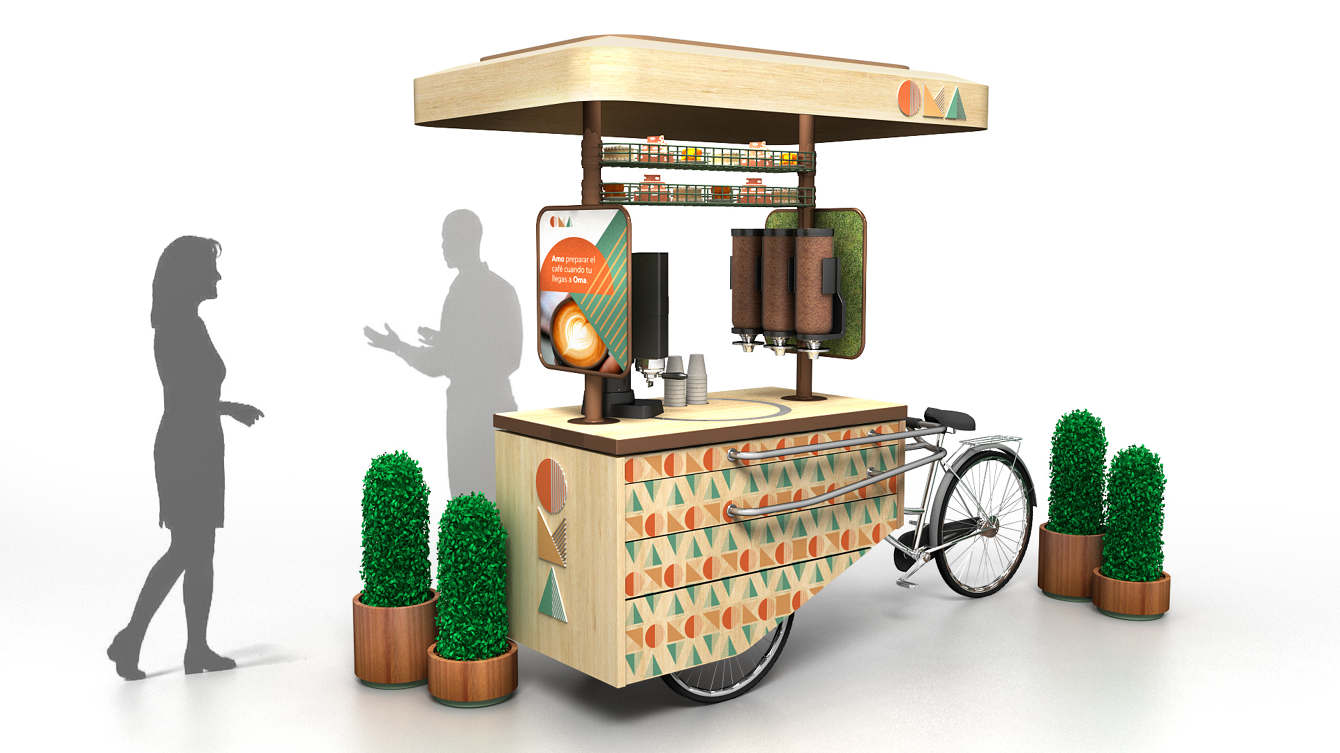
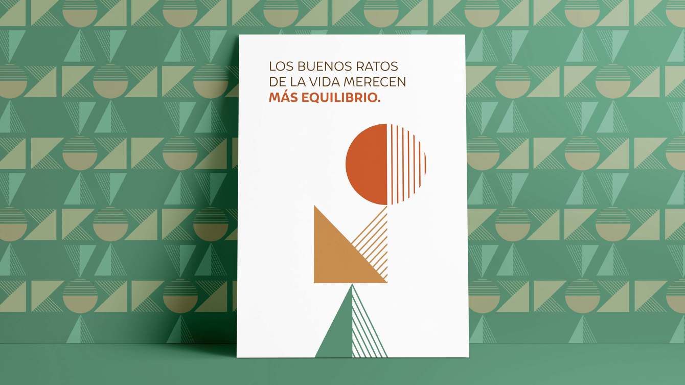
APPROACH - Developed a customer-centric brand identity built around the idea of taking a meaningful pause from everyday life. The visual identity centered on a bespoke logo inspired by the concept of time, with its modular geometry evolving into a flexible graphic system applied consistently across communications, packaging, and retail environments. Together, these elements created a more inviting and memorable brand experience that balanced simplicity, warmth, and modernity.
OUTCOME - Delivered a cohesive brand identity system that repositioned OMA for a new generation of consumers, strengthening its emotional connection with customers while creating a scalable foundation across retail, packaging, and brand communications.