Leão
Client
Leão
Project
VIS and packaging revamp (2024).
Credit
Teamwork developed by The Coca-Cola Company, Pharus and Pandemonium Type.
Revitalizing a Brazilian icon for a new generation.
CONTEXT - One of Brazil's most iconic tea brands, Matte Leão needed to evolve its identity to strengthen nationwide relevance while preserving its deep cultural connection to Rio de Janeiro and Brazilian lifestyle.
CHALLENGE - Refresh the brand to:
• connect more broadly across different regions of Brazil
• modernize the visual identity system
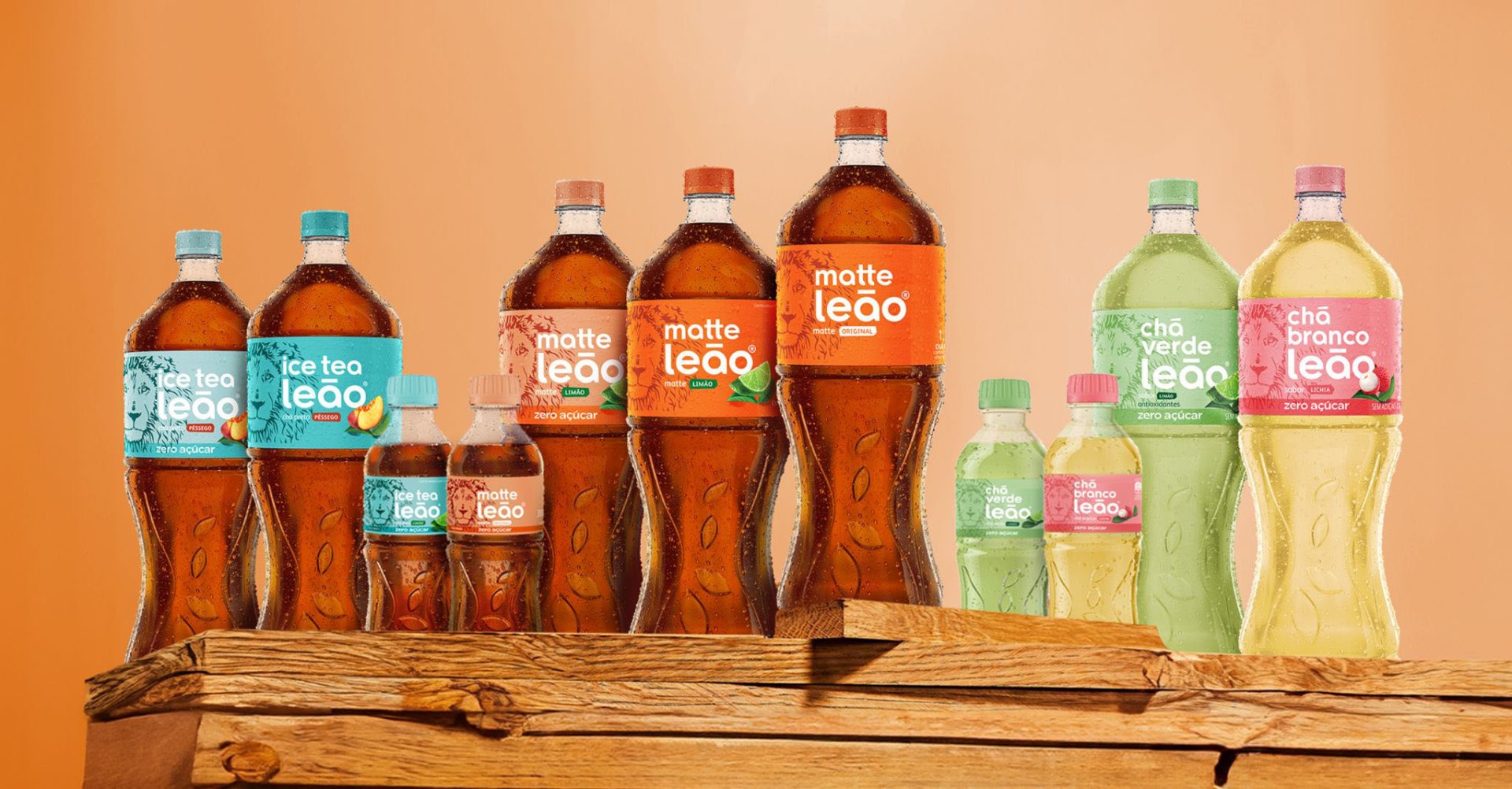
• improve portfolio navigation and consistency across touchpoints
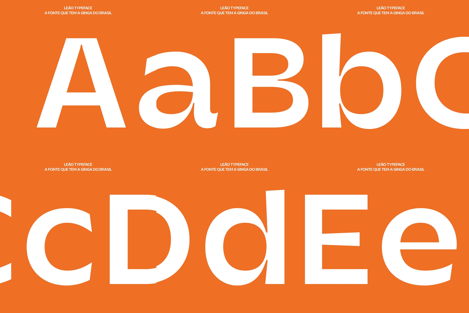
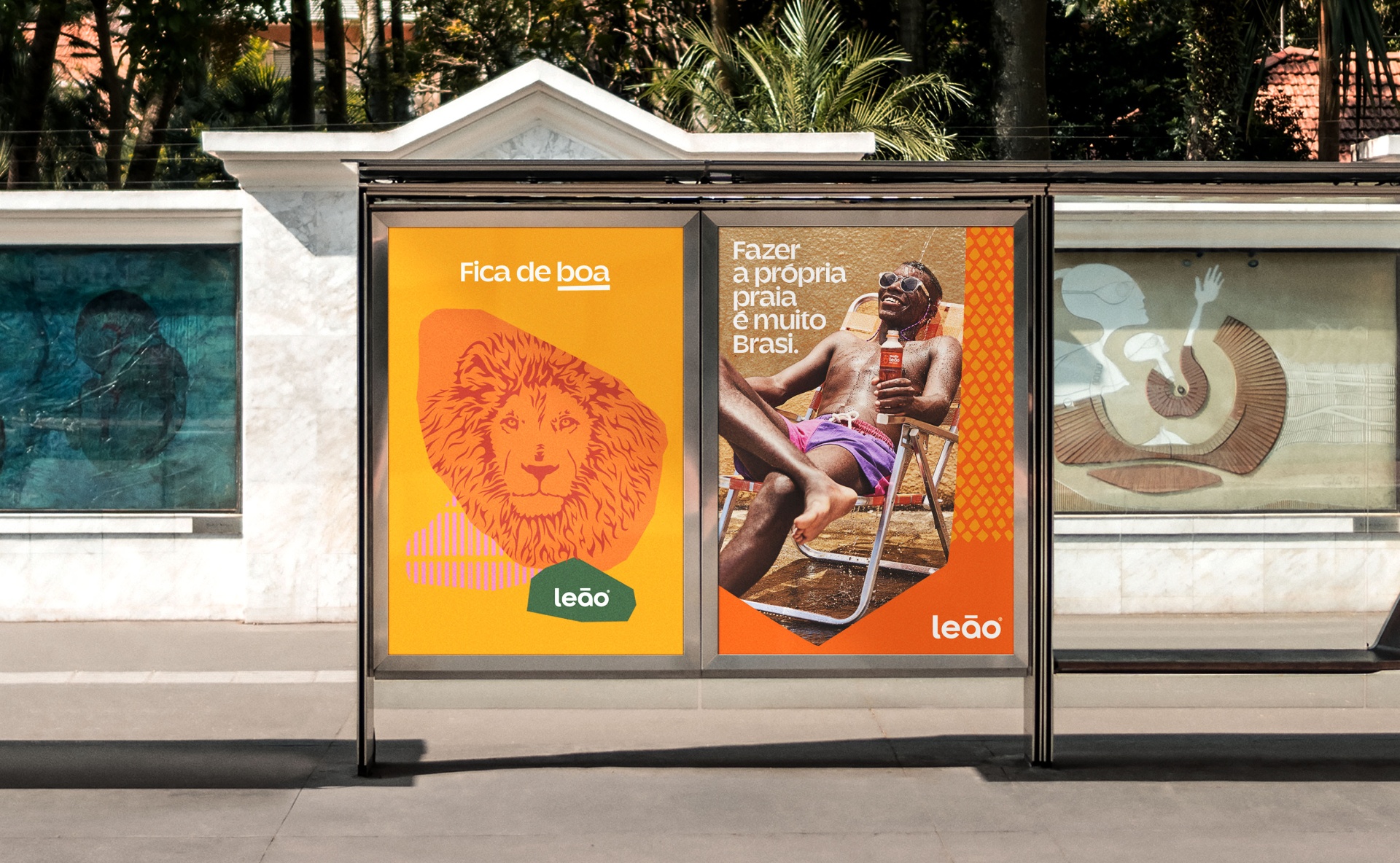
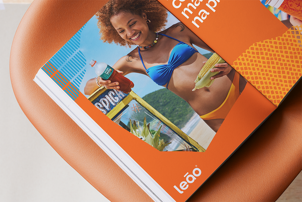
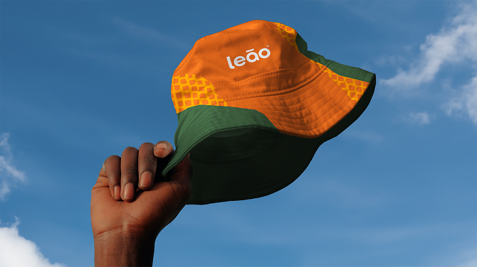
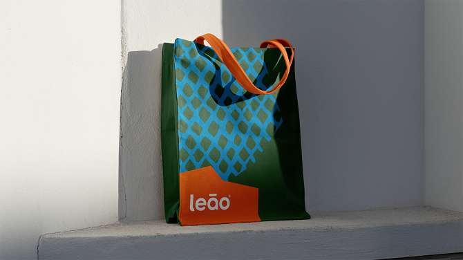
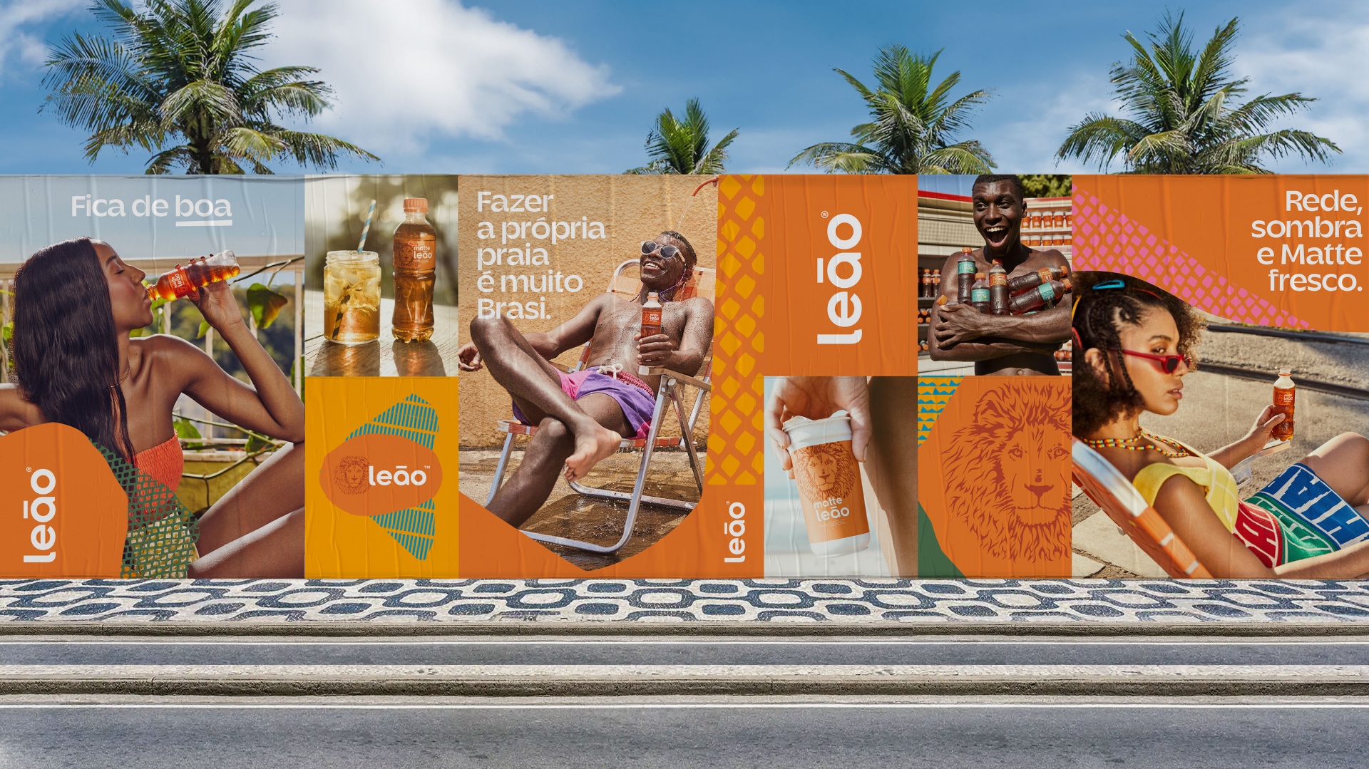
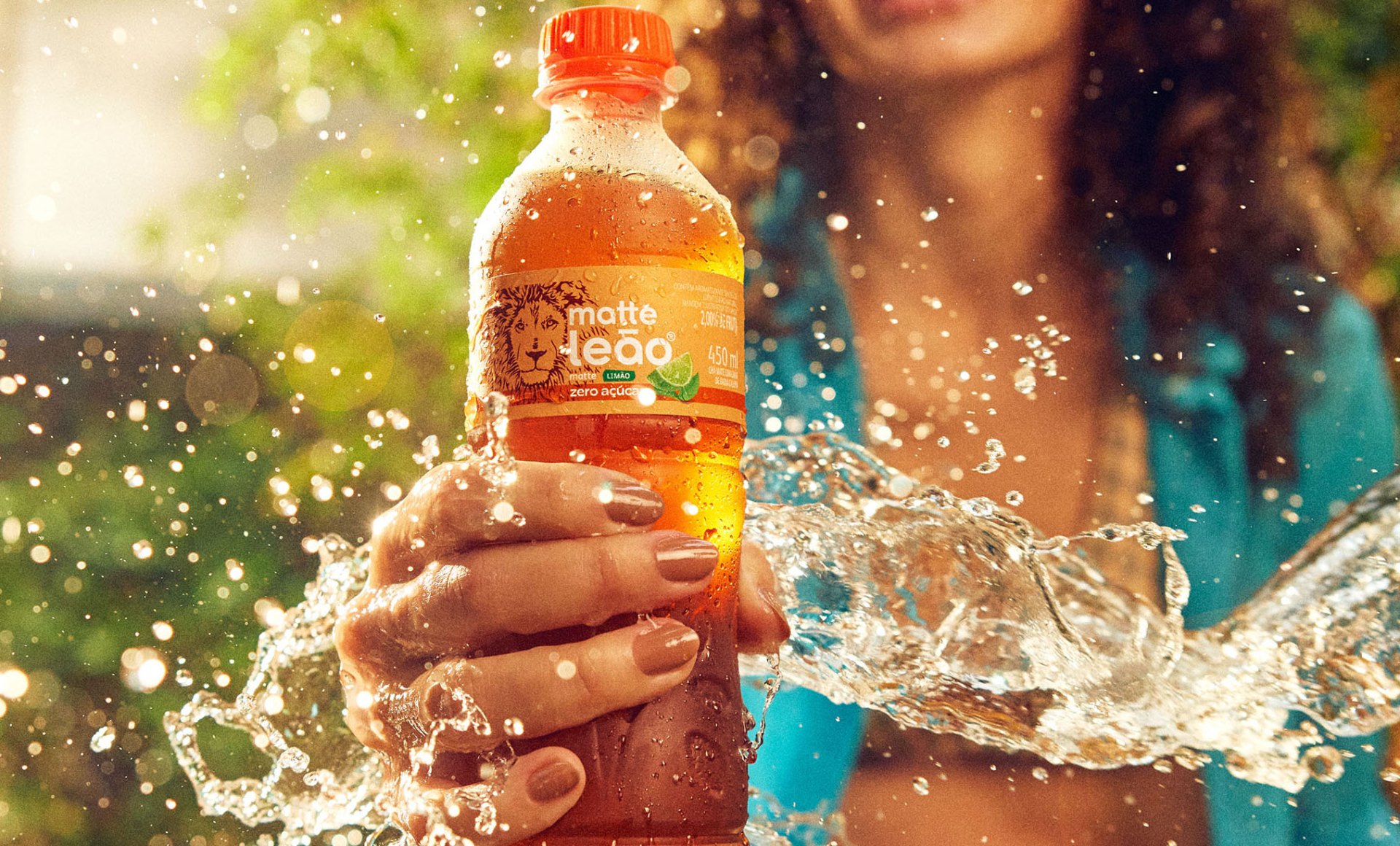
APPROACH - Led the evolution of the brand expression by combining cultural authenticity with a more contemporary and scalable visual identity system. Inspired by the richness of Brazilian street markets, the refreshed VIS introduced a more vibrant color palette, enhanced portfolio architecture, and a bespoke typeface designed to reinforce the brand's approachable and energetic personality across packaging and communication.
OUTCOME - Strengthened Matte Leão's emotional connection with consumers across Brazil, reinforced its position as a culturally relevant national brand, and created a more cohesive and recognizable identity system across the portfolio.